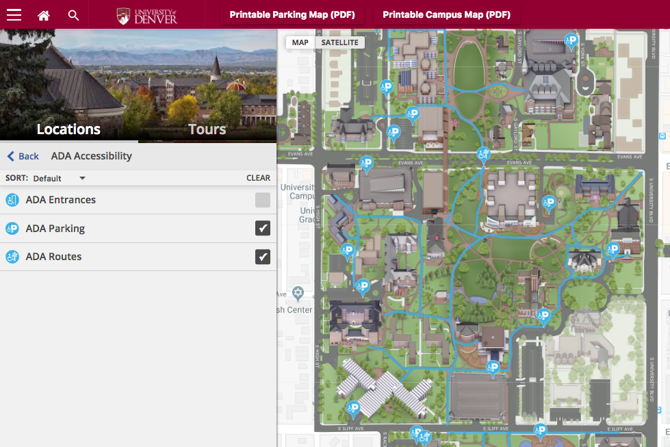
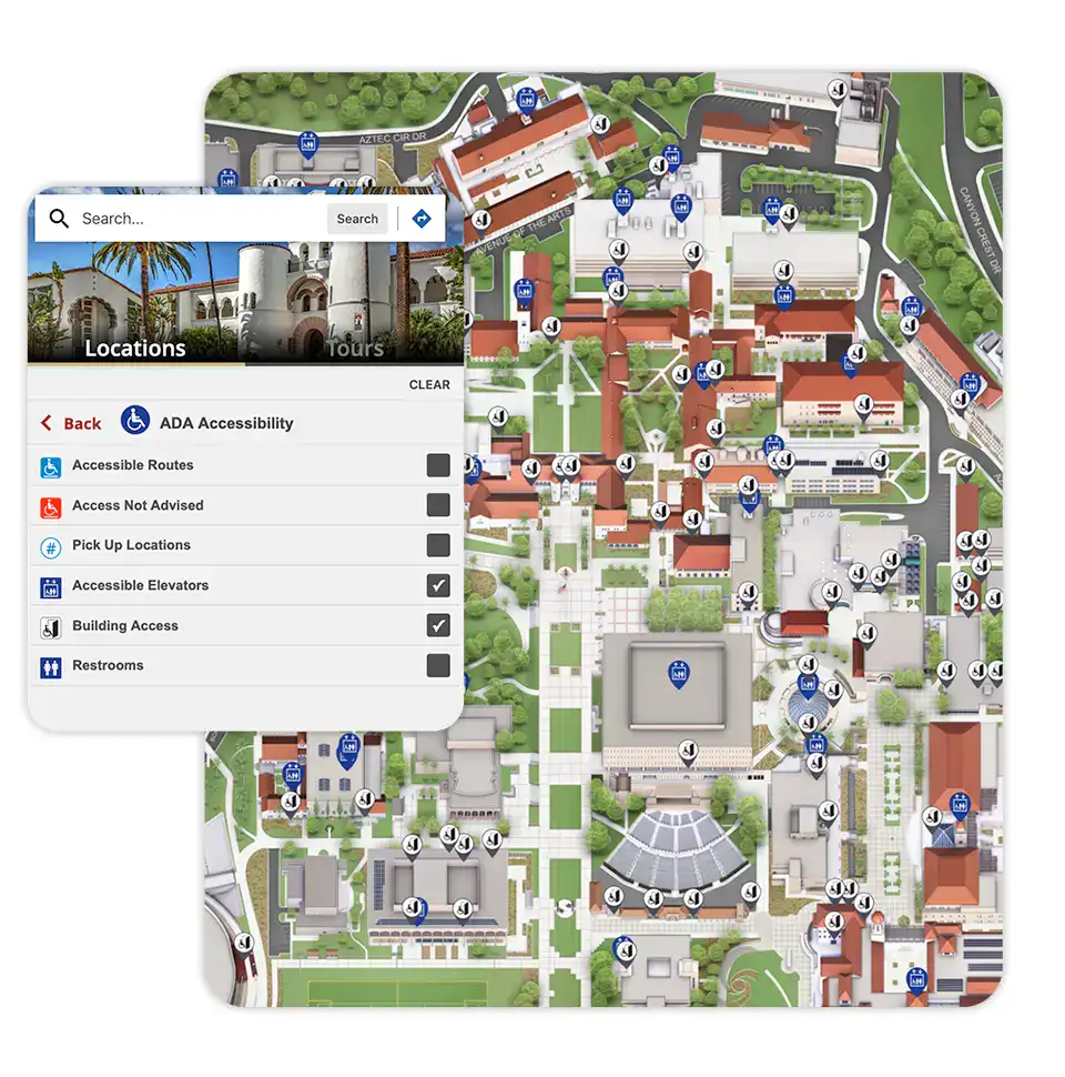
There are many benefits to using digital maps on your website. Something you should consider, though, is digital accessibility—ensuring everyone can find and benefit from any maps on your site.
When it comes to making digital maps accessible, there are two main things to consider:
- the map itself
- if it shows resources for the specific location(s) on the map, particularly around accessibility
You want individuals who have disabilities to be able to use your website and any maps on it. At the same time, you also want them to be aware of any physical or practical services, tools, or resources you offer at any of your facilities and within your business.
This is important, as the World Health Organization acknowledges:
About 15% of the world’s population lives with some form of disability, of whom 2-4% experience significant difficulties in functioning.
The percentage of the population with disabilities is expected to increase. According to the 2017 Disability Statistics Annual Report, “The American Community Survey (ACS) estimates the overall rate of people with disabilities in the US population in 2016 was 12.8%.” This is a gradual increase in the percentage of individuals living with disabilities, as in 2010, it was only 11.9%.
With these statistics and facts in mind, you’ll want to be sure your business can accommodate those with disabilities, not only with any physical buildings or facilities but also with your website, including digital maps.
Make Your Digital Map Accessible

When it comes to your site’s navigation and functionality, as well as the maps themselves, you want them both to be accessible.
Aspects of Accessibility to Consider
1. Colors & Text
Visual components of maps are important, not just for the sake of being aesthetically pleasing, but to ensure people can clearly see them. According to the World Health Organization, “Globally, it is estimated that approximately 1.3 billion people live with some form of vision impairment.”
You want the contrast of colors to stand out, especially for individuals who may be color blind. WebAIM suggests you “make sure that colors are not your only method of conveying important information.” They advise that if the purpose for posting a picture or image “is to communicate something about the colors in that image, then it is important to provide some other way of understanding the information.” So, for instance, if you use a color-coded key or route on a map, you’ll want to make sure the information is explained in another way for someone who cannot differentiate the colors to have a color contrast map.
Additionally, any text on a map should be easy to read and large enough. Avoid small, thin fonts or fonts that are too scripted, which may look nice, but are not as legible. Text overlays should also be in a distinctly visible color and stand out against the background.
It’s also beneficial to allow a website visitor to be able to zoom in on your site, including the text, pictures, and elements on any maps. You’ll want to keep your website compatible with screen magnification software.
In line with this, the Bureau of Internet Accessibility suggests that website developers should “eliminate content that is accessible via hovering over an element,” and to “instead make the element clickable. The content should disappear with a second click.” They also advise that error messages should be “displayed close to the action that has triggered them.” Otherwise, someone may not be aware that an error occurred if the error message appears on a different part of the screen where they aren’t zoomed in.
2. Screen Readers
The National Institutes of Health estimates that “the number of people with visual impairment or blindness in the United States is expected to double to more than 8 million by 2050, according to projections based on the most recent census data and from studies funded by the National Eye Institute, part of the National Institutes of Health.”
Website owners can make their site more accessible by adding captions to images, as well as by filling in the ‘alt text’ or ‘alt tag‘ attribute with a description of each picture or graphic. This way individuals who use screen-reading software, particularly those who are blind or have poor eyesight, can understand the context of any images on your site, even if they can’t see them. Then they can navigate your web pages better to find the information they are looking for, including any digital maps you provide.
ata-fontsize=”20″ data-lineheight=”23px”>3. Functionality, Keyboard Controls, & Navigation
Depending on the nature of an individual’s disability, they may be unable to access certain website pages or features the way the average website visitor would. This could make it challenging for them to find the web page you have a map on or be able to view the map itself, as well as other pertinent information on your site.
WAI-ARIA, the Accessible Rich Internet Applications Suite, provides a solution for making specific online functions accessible to those with disabilities that some people may be otherwise unable to use. For example, some individuals solely use keyboard controls instead of a mouse, and they’d need to be able to navigate a website’s menu and click on links this way. Even Google developers see the value in using ARIA to make a website and its features more accessible, particularly in instances where native HTML elements don’t suffice to add necessary functionality.
ata-lineheight=”27.6px”>Visible Keyboard Controls
WebAIM explains that “a sighted keyboard user must be provided with a visual indicator of the element that currently has keyboard focus,” and this is something a web browser will automatically provide. However, they suggest using CSS “to make the focus indicator more visually apparent and keyboard-friendly by adding a background color or other visual style to links, and other controls that will receive keyboard focus.”
Additionally, it’s also essential to ensure your site is functional and accessible, not just when someone is accessing it on a computer, but also on a mobile phone, tablet, or another device. In a survey taken by WebAIM in January 2014, 72% of individuals who reported using a screen reader said they used it on a mobile device. This was an increase over past years and shows that you should expect a significant percentage of website users, including those who are disabled, to be accessing your site on a mobile device.
4. Simplicity
It’s important to avoid ‘information overload’ in general, but even more so when it comes to website visitors who may have cognitive impairments, such as memory loss or a learning disability.
When you design maps for your website, and even in the text and other supplemental details you include, it’s best to keep things simple. There may be instances where there’s a lot of information you want to include on a particular facility or a very detailed description of one or more of the services you provide. In these cases, consider having a ‘learn more’ button or link to a separate map or web page that dives deeper into the additional details. People who are interested in more information will click to see it, and you’ll avoid overwhelming the average website visitor or potential customer with too much info at once.
In addition to avoiding having too much information, you also want to keep the info you have simple and easy to comprehend. Yale University recommends writing “at as low a reading level as is appropriate for your content.” They state that “doing so benefits people with cognitive impairments, people who do not speak English as a first language, and people who may be distracted while reading.”
Guard against having pages on your website that are too cluttered, like too many ads, popups, links, etc. These things can be distracting and even interfere with your user experience when someone is trying to view a map or other important info on your site.
a-lineheight=”41.4px”>Highlight the Accessibility of Your Location(s)

Companies often invest a lot of time and money into building or acquiring facilities that are accessible. This is of little benefit, though, if people who need the accessibility are unaware of how or where it’s available. If they don’t find this information on your digital map, or are unable to access or understand the map due to the nature of their disability, they won’t be able to benefit from your location’s accessibility.
In addition to persons who are disabled, individuals who have no difficulties themselves may take into consideration how one or more of your facilities may accommodate their loved ones who may be accompanying them, who do have some sort of disability.
When designing a virtual map or tour of your facility (including buildings that may be constructed in the future), try to imagine it from the perspective of someone who has disabilities.
Aspects of Location Accessibility to Consider
- Where will individuals park when they arrive?
- Are accessible parking spots highlighted on the map?
- Are there different sections of accessible parking?
For instance, hospitals and medical complexes often have parking broken down into different sections based on the reason for someone’s visit or the specialty care they’re receiving. Handicapped spots in one area of the parking lot may be on a different side of the building than where a person needs to go. Therefore, it’s best to highlight different places in a facility where someone may need to go and where they would park, especially for those who are disabled. - Is there valet parking available or a place to drop people off near the door?
- Where are ramps, elevators, etc., to accommodate individuals who need a wheelchair, walker, or who cannot handle too many stairs?
This should highlight entrances and exits for a building and also accessible amenities within it. - Are there wheelchairs or other equipment for the disabled available for use in the building, and if so, where are they located?
The Benefits of Making Your Digital Maps & Website Accessible
1. Customers and website visitors with disabilities will be able to access information on your facilities and services.
2. People will understand how you can accommodate their needs, including when they travel to any physical locations where you provide services.
3. Accessibility can contribute to your website ranking higher on search engines, which means more people will find you online.
Search Engine Journal states, “Improved SEO often goes hand-in-hand with web accessibility. With an improved experience for all users, your site will have lower bounce rates, higher numbers of conversions, less negative feedback, and other positive responses—all of which matter to search engines when ranking a site.” Of course, accessibility is not the only thing you need to consider when optimizing your website for search engines, but when done well, it can help your rankings.
4. Your business and website can gain a positive reputation in the community for being accessible and for showing consideration to those who are disabled.
Design Accessible Digital Maps for Your Website
Maps can be made accessible with well-chosen colors and text, by optimizing for screen readers and keyboard controls, by making maps and your website itself functional for a variety of devices, by allowing content to be accessed in multiple ways, and by keeping navigation and site structure simple.
You can then utilize digital maps to highlight the accessibility your physical locations offer, such as handicap accessible parking and other accommodations. Overall, by making maps and your website accessible, you can gain more customers and website visitors, and establish a better reputation as a business.
Concept3D understands the need to develop high-quality maps that can be accessed by everyone and works with our clients not only to make their 3D maps as accessible as possible but also to highlight on-campus resources.
