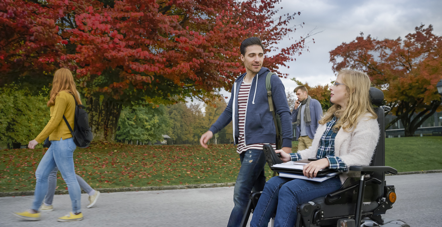
Accessibility has become an increasingly crucial topic in digital communications. A non-accessible digital platform of any kind doesn’t just risk legal jeopardy but also closes off a potentially significant portion of your target audience. According to the U.S. Census Bureau, more than 40 million Americans live with some type of disability.

Globally, according to the U.N., that number expands to almost 1 billion, or 15% of the world’s population. On the flip side, these numbers present a significant opportunity: if your digital presence can accommodate and exceed the expectations of your entire target audience, your institution could be at a significant advantage compared to others who are not.

Are you making the grade on the new WCAG 2.2 requirements? Read our blog on how higher education institutions can meet WCAG 2.2 requirements.

Campus maps, specifically, matter when it comes to accessibility. Persons with disabilities will need to know how to find the right building entrances, restrooms, and more. Most importantly, they deserve to know how to navigate around campus just as much as the rest of the population. That’s why in this post, we’ll explore the four factors that make your campus map accessible.

But first things first. Before we dig into the nuances of digital map accessibility, let’s go deeper into the four types of disability any modern campus map has to be able to accommodate.

The 4 Basic Types of Disability

When hearing the word disability, most of us consider physical disabilities or extreme versions of disability, such as deafness. The reality, of course, tends to be much more nuanced. While there are many disabilities, most experts generally group them into four basic categories:

  • Cognitive impairments include memory or short-term memory loss as well as cases of dyslexia or learning disabilities such as ADHD.
  • Hearing impairments typically result in at least a partial loss of hearing or deafness at the end of the scale.
  • Vision impairments refer to low vision, including blurred vision or a loss of central vision, along with general blindness or more specific colorblindness.
  • Mobility impairments may refer to reduced dexterity as well as reduced limb functions or, in some cases, absent limbs.

However, it’s important to note that these four disabilities typically exist on a scale, and can overlap as well. Hearing loss may be partial and may combine with a mobility impairment to create a unique situation. Any communication effort, including map creation, needs to keep these nuances and potential overlaps in mind.

How Users Interact With Maps Online

Beyond the types of disability to keep in mind, campus map hosts also need to consider just how end users will interact with the map depending on their disabilities.

That means keeping a number of considerations in mind. For web technologies, keyboard control should be a central navigational feature, especially when it comes to ensuring a natural focus and order. While most users will use a mouse to navigate around the map, a considerable portion of the population will use their keyboard as their main navigational option.

Of course, other technology may enter the equation as well. For instance, screen readers are a common tool among users with vision impairments specifically, requiring a setup designed to be read instead of just seen. Screen reading technology is becoming increasingly popular among older users as well.

The key here is simple. From ensuring the right focus to tagging images and keeping text size and thickness in mind, it’s all about setting up your campus map page so that no matter which audience member uses it, they can navigate it naturally and logically from top to bottom, and left to right.

P.O.U.R.: The Four Elements Determining Campus Map Accessibility

Most experienced digital communicators have at least passing familiarity with  WCAG 2.0 and 2.1, the Web Content Accessibility Guidelines established by the World Wide Web Consortium. While not in themselves legally binding, WCAG standards are the basis by which national laws like the Americans with Disability Act in the United States or the General Equal Treatment Act in Germany judge a website’s accessibility.

An in-depth examination of the WCAG guidelines is a complex topic and beyond the scope of this article. Fortunately, for the sake of your map, you’ll just need to know the four categories of the guidelines that can make your campus map accessible. Known as Perceivable, Operable, Understandable, and Robust, you’ll see them referred to under the acronym POUR. Let’s examine each in detail.

Making Your Campus Map Perceivable

First, your map will need to be perceivable by all members of your audience. That means finding and publishing multiple ways to present and understand your content so that no matter the user, it can be easily seen, heard, and found. This can happen in a variety of ways:

  • For non-text content like images, provide ALT text that describes the image.
  • Written text, provide an audio voiceover option to help users with vision impairments or dyslexia.
  • Audio and video options, provide a written transcript for users with hearing impairments.

You’ll also need to take care that the information, as well as your overall platform, is presented in multiple ways. For instance, a simple HTML text version of your campus map can offer a structured, non-visual way to present the same information to users who prefer or need this kind of presentation.

Making Your Campus Map Operable

Second, map designers need to make sure that all functionality is available for all users. That means ensuring that no matter the tools used to navigate, it should be natural and easy to accomplish. Examples include:

  • Making all functionality available from a keyboard, including moving through navigation, selecting map layers, and more.
  • Use arrow key controls for users to pan and zoom the graphical representation of the map.
  • Enable users to use alternative inputs beyond keyword and mouse. The more options, the better.

Especially for virtual tours and 360-degree maps, auto-playing and auto-rotating content also play into this variable. Users should always have enough time to understand the content, and easily move to more manual control as needed.

Making Your Campus Map Understandable

using a phone to navigate a campus map.

Using a phone to navigate a campus map.

Can your audience understand all relevant content in a timely manner? Does it appear, and can it be operated, in predictable, logical, and intuitive ways that is quick and easy to grasp regardless of the users’ technology expertise? The key here is giving users exactly what they expect, from the moment they start using the map. That includes helping them easily avoid and correct mistakes in anything from navigation to search and filling out forms. If they miss or miss-fill a form field, does the error message appear close enough to the field to make a fix intuitive?

Making your map understandable also means making sure that all text and content lines should be easy to read and understand. For graphics, ensuring proper contrast between foreground and background helps users with vision impairments still easily visualize what they need.

Making Your Campus Map Robust

Finally, every campus map should be robust in that it should be easily and naturally compatible with all current and future tools they might use to navigate it. That includes a wide range of options:

  • Does the map function equally well on all browsers, from Chrome to Safari?
  • Function equally well on all devices, from desktop computers to mobile phones?
  • Operate equally well for all operating systems, from iPhones to Android?
  • Function equally well with all major keyboards, screen readers, and other secondary devices?

In other words, this final category is all about technical accessibility. No matter what technology your users use, out of choice and out of necessity, tours and maps need to be marked up and built to accommodate the systems’ different nuances.

An Accessible Map in Action

The above, of course, is not just a theoretical exercise. Already, we’ve worked with countless universities to build more accessible campus map solutions. Take the map we’ve built for the University of Colorado at Boulder as an example. An accessibility level provides an easy view and navigation to the accessible entrances of all buildings as well as hearing loop locations. But that’s only the beginning. Throughout the map, we’ve integrated landmarks that allow users with screen readers to easily jump around major pieces of the overall experience, from the sidebar to the banner menu and the map itself.

Skip links help users navigate to where they need to go more quickly and intuitively. Of course, that is only one of many accessibility examples of modern campus maps. In today’s digital environment, focusing on that level of accessibility is no longer optional. It’s an absolute necessity, not just for legal compliance but also to optimize your experience for all members of your target audience.

Looking for more information? Listen to our recent webinar on campus map accessibility, including a live look into just how the University of Colorado Boulder’s map works with screen reading technology-enabled. For more information on how this technology could work for your campus contact us. Let’s work together towards a more integrated, accessible, and positive experience for all relevant audiences.