
College websites share information about programs and student living, offer virtual tours, and show off gorgeous campuses. But you’ll need an easy-to-navigate design that takes full advantage of digital capabilities like high-resolution 3D imagery to draw in prospective students.
Communicating a strong identity through a high-end website gives your school authority and helps build trust. On the other hand, a poorly designed website makes it difficult to find information about your academic programs or campus — and may even be impossible to access for those with disabilities.
If you’re planning to redesign your website to be more immersive and accessible, the first step is finding inspiration. There are as many unique websites as there are colleges, and everyone has their own take on highlighting what makes them special.
These websites, however, stand out for their bold designs that center around the needs of the student.
Why Website Design Is Important for Universities
University websites are often the first touchpoint with prospective students, who do the majority of their research online before they ever set foot on a college campus to visit. That’s why websites are so important — they share a school’s identity and help students imagine life on campus.
But university websites are not just part of marketing for colleges — they’re also the digital center of the student experience. It’s where students visit to access resources, navigate campus, sign up for classes, register for events, and more.
So it’s vital for websites to be accessible for all students, as well as user-friendly and useful enough to invite them to return again and again. A good website can be a part of your student recruitment and engagement strategy, as well as act as a digital hub for all things college.
What Are the Key Elements of the Best University Website Designs?
Higher education websites are a place for digital recruitment, soliciting donors, and facilitating class registration. It may seem almost impossible to reach each of these very different audiences with the same homepage, but the best university websites tackle this challenge with grace. They forge solutions for sharing their identity while helping everyone find the content they need.
- Intuitive navigation and user-friendly layout: Make it easy to find what students are looking for. Clear menus with links to the most commonly needed pages, a logical page hierarchy, and an effective search bar on the homepage are good places to start.
- Strong storytelling component that highlights what makes your campus unique: Showcase the values and experiences that make your school stand out, whether it’s state-of-the-art labs or a caring administrative culture. Student stories, highlighting accomplished faculty, and including dynamic media that reflect the energy of campus life make a big difference.
- Mobile-first and responsive design: Mobile devices lead desktops in U.S. web browsing by more and more every year. With a responsive, mobile-first website design, students can access information on the go and in the moment they need it.
- Engaging visual design and branding: Reinforce your school’s identity with cohesive branding across your website. Clear, uncrowded visuals with plenty of whitespace help students navigate your website. Photos of your campus and students bring authenticity.
- Accessibility and inclusive design: Your website should be compliant with the ADA, align with at least WCAG 2.1 Level AA standards, and follow any additional local regulations for accessibility.
- Strong calls-to-action (CTAs): Calls-to-action like “Apply Now!” and “Schedule a Tour!” highlight where students can take the next step on their journeys. Ensure they are clear, concise, and thoughtfully placed to entice prospective students.
- Virtual tours and interactive elements: Give students a glimpse of life on campus with immersive digital experiences. Virtual tours, dynamic campus maps, and other tools can help students imagine their day-to-day lives at your school.
- Robust search and personalization: A great search tool and AI-driven content suggestions (similar to how Netflix suggests content based on past browsing) can help students find more niche content that applies to unique situations and personal needs.
- Integrated event and news sections: Keep students engaged throughout the year with news sections and up-to-date event listings via interactive calendars.
The Top University Website Designs in 2025
In no particular order, we present to you the most unique, effective, and accessible university websites of 2025.
Yale University
What stands out: Straightforward design that lets their prestige speak for itself
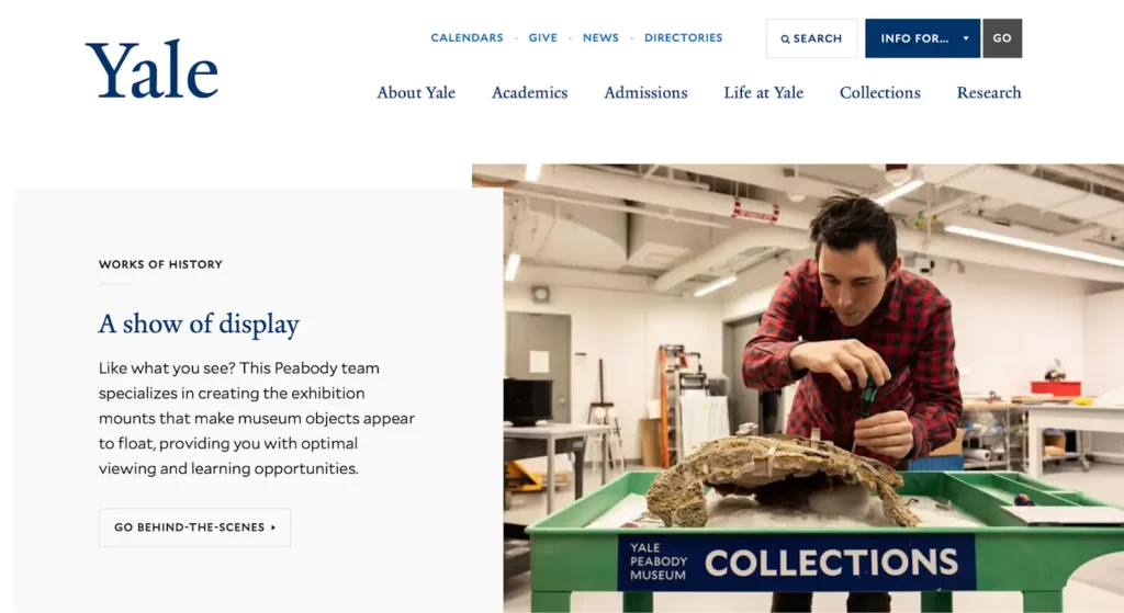
As one of the most prestigious universities in the United States, Yale makes their impact unquestionable by putting important work front-and-center on their site.
The minimalist, modern design uses lots of white space and an engaging shot of someone in action. It’s not overwhelming, but it provides a clear message about who Yale is.
The campus map stands out as a tool for both prospective and current students. Intuitive and interactive, it not only helps students navigate campus but also learn about different buildings’ accessibility features and find lactation rooms, parking, and other useful day-to-day information.
University of Southern California (USC)
What stands out: Bold illustration of impact and student life

USC boldly prioritizes the latest news on their homepage, and the eye-catching, simple design with classic fonts makes it engaging. As you scroll, the page highlights news-worthy faculty and university research.
The menu button in the top right helps guide the next steps of web visitors. It opens a large but simple menu and features photos of USC football fans in the stadium. This illustration of student life draws potential students in while they figure out where to navigate next.
Tulane University
What stands out: Highlighting the charms of their location and intimate campus
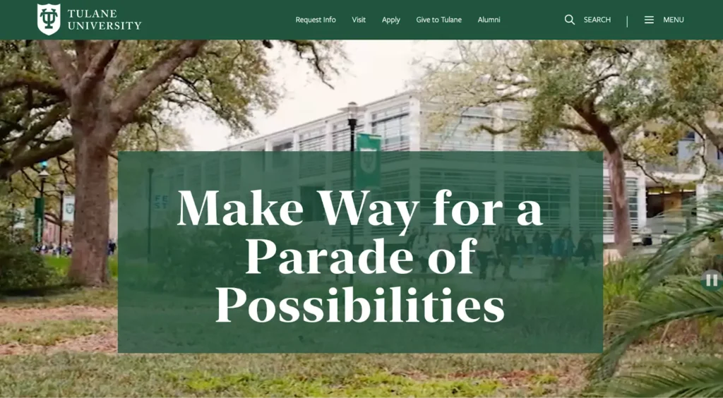
Tulane, a smaller university, highlights campus life and their vibrant New Orleans location on their homepage. The header features a video background that shows a campus filled with energy, instantly communicating the school’s vibe to prospective students.
The top navigation menu offers compelling calls to action that prompt visitors to take the next step. But if they prefer to keep exploring, they can scroll to discover more highlights of the Tulane experience and a calendar of upcoming events showcasing what students can expect when attending.
Ole Miss
What stands out: A strong message illustrated by compelling imagery, including interactive 3D elements

The University of Mississippi takes a unique approach — centering their slogan delivers an instant message to prospective students that Ole Miss will transform their lives. But the bottom of the hero hints at what’s next. As you scroll, images of the beautiful campus populate.
This website centers around students, putting academics, admissions, and student life first in the navigation bar. But the homepage still appeals to multiple audiences, including their strong alumni network.
The interactive, 3D map is one of the best parts of their site — with full 3D illustration, you can even see the trees, bricks, and other details that bring the campus to life.
University of San Diego
What stands out: Immersive digital elements that humanize the campus
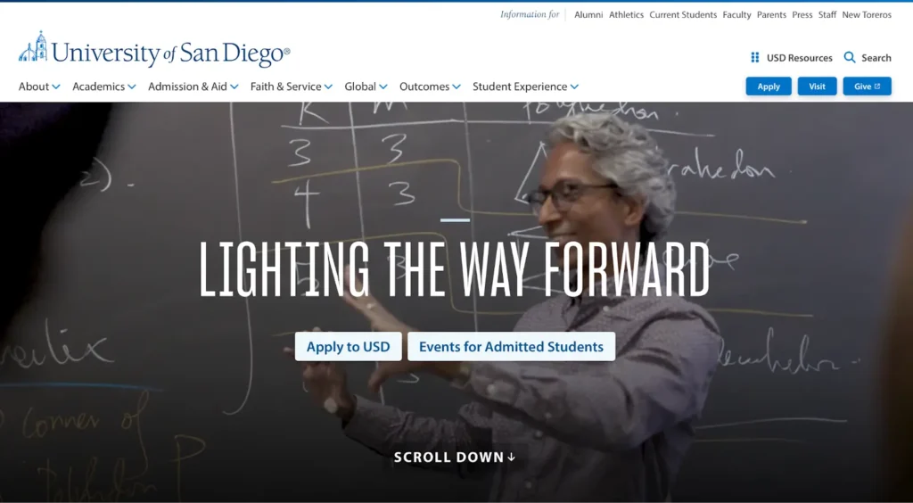
USD features a video header, creating an immersive user experience that gives you an instantly feel of what it’s like to be a student on campus. This commitment to immersiveness extends to the virtual tours built into the campus map. The different tour options — including a sustainability tour and Changemaking tours — really highlight what makes USD unique.
As you explore the site, USD puts a big emphasis on the people on campus. Whether they’re faculty stories or student success stories and testimonials, that emphasis humanizes the college and gives prospective students something relatable to connect with.
Boise State University
What stands out: Strong calls to action and a welcoming school identity

Boise isn’t shy about recruitment. They know most of their homepage visitors are prospective students, and they center a clever call-to-action that also highlights the strong school spirit. That tells students right up front who they are as a college.
Compelling photography throughout the site showcases regular students in casual clothes — making it easy for prospective students to imagine themselves attending. Site elements like strong color contrast show they put thoughtfulness towards accessibility. Combined, these aspects send a powerful message of inclusivity and welcoming.
Louisiana State University (LSU)
What stands out: Action, video, and interactive elements draw in students
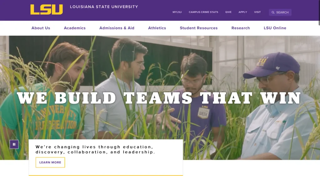
LSU’s school website really leans into action-heavy video and photography that’s colorful and filled with human expression, portraying the campus vibe as well as any digital experience can. Meanwhile, the bold graphics featuring LSU colors enforce a strong identity.
The interactive events calendar, linked on the homepage, is a central location to find out about everything happening across campus. It not only draws new students in but also helps keep students engaged once they become Tigers.
Jacksonville University
What stands out: A vibrant, hard-to-forget aesthetic that hints at what student life is like by the ocean
Jacksonville University’s site viscerally highlights the student experience of a campus next to the ocean. Right away, we have images of water, unusual lime green colors, and a featured student standing on the beach. It’s sure to be memorable in a sea of muted college websites.
We like that there’s a link to the student dashboard right on the homepage — no doubt current students appreciate the easy access to needed content.
This attention towards students is also shown in how accessibility is prioritized, with the video elements featuring both captions and a link for a full transcript.
James Madison University
What stands out: Practical layout and immersive elements
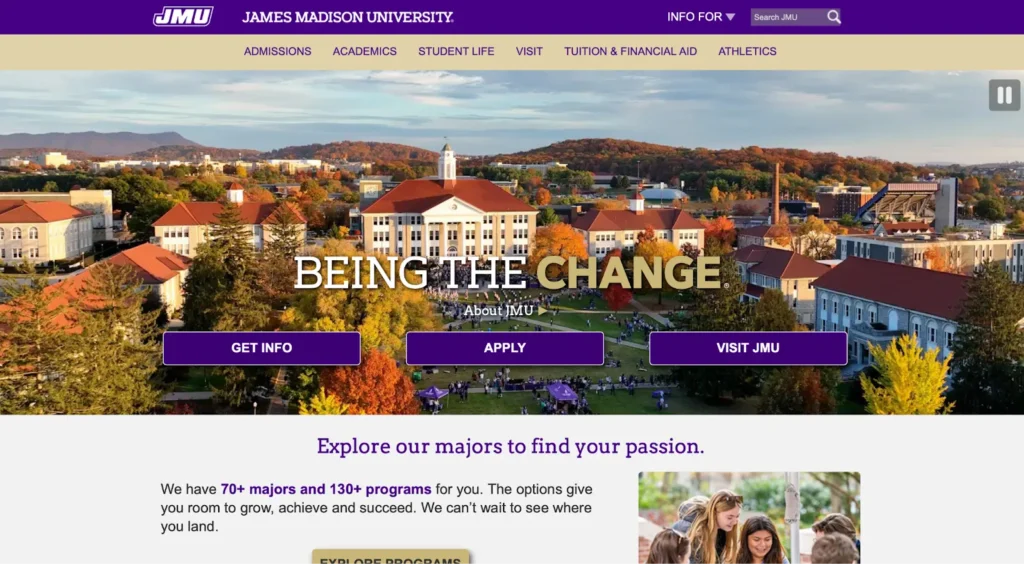
JMU’s website gets to the point with three clear buttons featuring common calls to action right up top. Plus, this is one of the few sites we saw that highlighted its academic programs on the homepage.
The navigation bar is easy to read, and when you hover your mouse, each category shows additional options. This makes it simple for users to jump to a variety of places right from the homepage — reducing total clicks and frustration.
Their site also makes immersive elements practical. The video hero shows off the campus, while an immersive map with virtual tours gives students the information they’re craving about everyday life on campus.
University of Louisville
What stands out: Streamlined content and responsive design
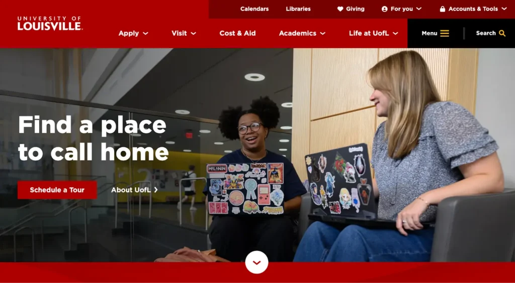
UL’s bold website is simple but visually engaging, with a strong brand identity. The content is extremely streamlined, with lots of white space, easy navigation, and concise text. This simplicity combined with boldness is consistent throughout the site, which also features a visual calendar and authentic photography.
Plus, its responsive design makes it extremely easy to use on mobile. That’s a big benefit for students who are looking for information on the go.
Southern Methodist University
What stands out: Strong use of color and interactive elements
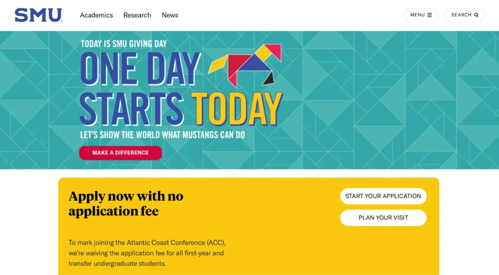
SMU’s site grabs attention right away with engaging illustrations and bold color choices. It leaves the impression that campus is inspiring and lively.
Interactive elements placed throughout the site keep it memorable. The buttons change color and links light up when you hover, while the areas of study are displayed in a moving list that you can click. Clickable video elements add another layer of immersion.
Southern Utah University
What stands out: Unique and effective navigation
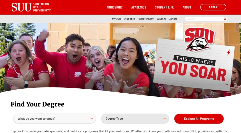
SUU has really interesting navigation solutions on the homepage. A button menu, for example, allows users to choose who they are (first year? transfer?) in order to access personalized content. This “type of student” menu is used again on different pages, which prevents users from scrolling through irrelevant content before finding the details that apply to them.
We also haven’t seen this heavy use of dropdown menus on any other university site. Again, this helps users find what they’re looking for with precision as soon as they visit the site.
The rounded button and dropdown elements are friendly and familiar and remind us of filling out a typeform. We imagine this reduces resistance to learning more and exploring the site.
University of North Dakota
What stands out: Great use of movement and a cohesive design system
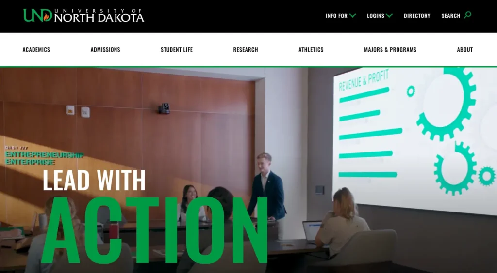
UND doesn’t just say they take action — they demonstrate it. The video hero plays when you open the site, and lots of tasteful movement throughout keeps prospective students engaged. Examples include animated buttons, feature items that bounce when you hover, and animated underlines.
It’s one of the most cohesive site designs we’ve seen — they even illustrate their slogan with subtle visual cues, like arrows and italic lines that imply movement. This goes a long way towards strong brand identity.
Wake Forest University
What stands out: Striking yet classic visuals with great social integration
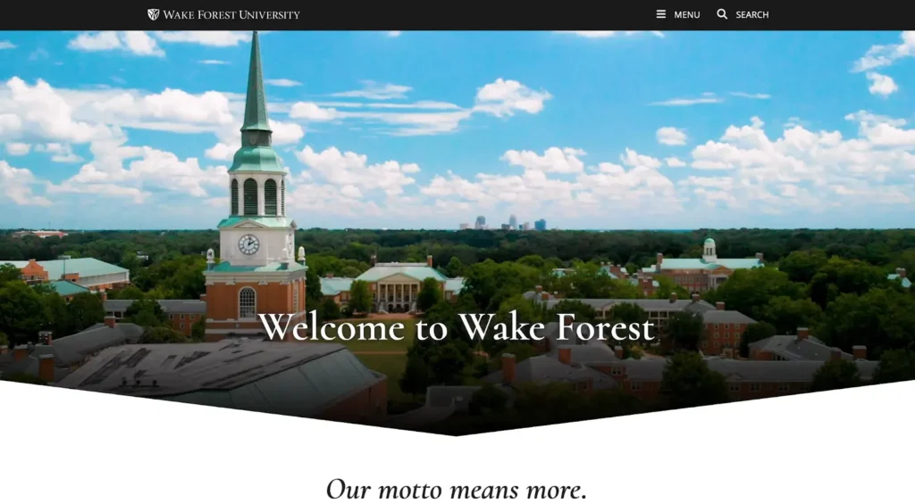
The choice of a chevron with a dynamic video hero is immediately striking. But the bold, clean design choices don’t abandon their history. The elegant typography and colors, along with the classic shield logo, combine with the design beautifully to signal a school with a strong legacy that has adapted to serve a contemporary generation.
Another signal of their positioning is the way Wake Forest has incorporated social media and calendar events on their pages. Both their Instagram feed and calendar events are tastefully pulled in and flawlessly integrated. Embracing modern tech while seamlessly incorporating it into a lovely experience is just a taste of what students can find at this university.
Vanderbilt University
What stands out: Uniquely immersive web experiences
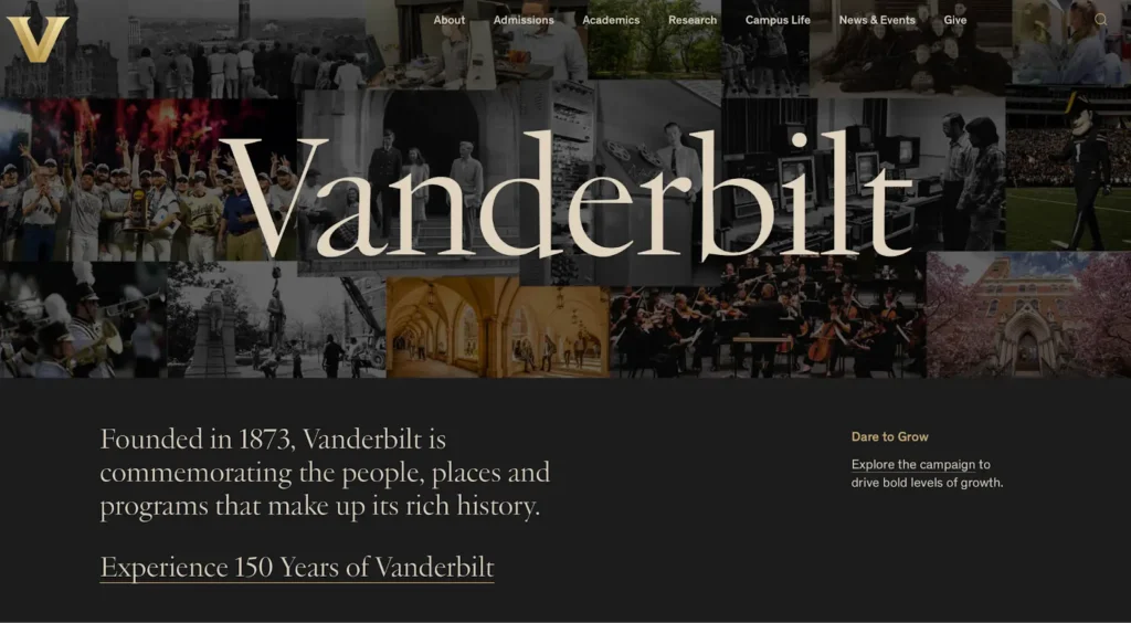
Vanderbilt is another educational institution with a strong legacy, and they put that front and center. If you click “Experience 150 Years of Vanderbilt,” it opens an immersive multimedia web experience with motion, photos, text, and video. It feels like walking down the halls of an elegant museum.
They aren’t stuck in the past, however. The immersiveness extends to the needs of current and prospective students, with an interactive program finder tool featuring useful filters, a gorgeous news page that integrates social media with conventional articles, and other unique web experiences.
Improve Your University’s Digital Accessibility With Concept3D
While immersive web experiences are impressive, the truth is that the most important trait of a university website is accessibility. If a student can’t access the information they need — and quickly — then the buck stops there.
Concept3D brings your campus to life online with experiences that are both immersive and accessible. From 360° digital tours and interactive maps to centralized event calendars and communication, we blend art and science to seamlessly showcase what makes your school special.Curious how we do it? See a demo today.