If you’re a frequent reader of this space, you know how much we’ve discussed the benefits of both interactive maps and enterprise virtual tours. But just as important as these benefits are the fact that neither of those tools and platforms exist in isolation. Instead, they’re part of a larger user experience as potential customers, students, and other stakeholders interact with you in the digital realm via marketing map.
Buttons can build and expand on that connection, taking your marketing map or interactive tour to part of a more comprehensive, strategic approach. Done right, they can drive conversions, provide technical feedback, and even uncover potentially hidden sections of your map that your audience deserves to see.
So in a recent webinar, we dug into the concept of buttons as they related to your Concept3D interactive map or tour. You can watch the video online but if you don’t have the time, consider this article your overview of a concept that can take your wayfinding and virtual experience tools from good to great.

How Top Bar Buttons Create a Marketing Map Intersection
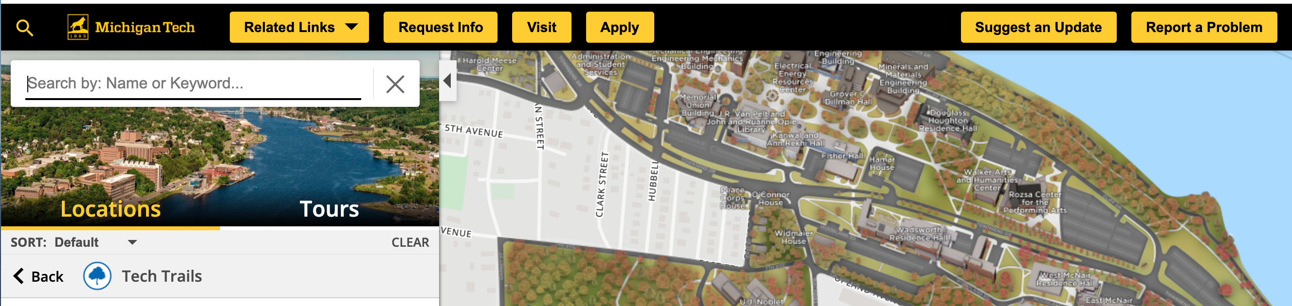
First, a note: top navigation bar buttons come standard with both our interactive map and virtual 360-degree tour platforms. You don’t have to pay extra. You just need to know how to integrate them.
That begins with understanding just how you can leverage your buttons for a deeper, more meaningful user experience. The possibilities here range widely:
- Leverage your buttons to get outside of your campus boundaries. Link to anything from local attractions and trails to the regional tourism board’s website.
- Connect your map more closely to your website, linking to important information for your core audiences that would take up too much reading space on an otherwise visual tool.
- Connect your virtual map to your 360-tour, and vice versa, by linking from one to the other for a seamless transition.
- Highlight critical campus info, including potentially crucial information your audience will want to know in connection to opening hours, COVID-19 operating procedures, and more.
- Link to your social media account or other marketing platforms you want your users to find easily.
- Connect your map with fundraising or ticket sales efforts, and even event registration pages, to move real user action.
- Link to feedback forms about your map or virtual tour, allowing your audience to flag errors or make improvement suggestions that fit a continuous improvement mindset.
And that’s just the beginning. You can use these buttons to both drill down on specific sections within your map and any external link. The same options are also available within your 360-degree tour, though the use cases there might be a bit more marketing-oriented and less functional. The sky is (almost) the limit; the details are entirely up to you.
Use Cases that Showcase the Power of One or Two-Click Button Experiences
All of the above examples, of course, are theoretical in nature. So let’s get specific. Concept3D offers three types of buttons that you can place into the top menu bar of your interactive map or virtual tour:
- Primary Buttons, which can be fully branded with custom background and hover-over colors.
- Secondary Buttons, which have the same background as the top menu bar but still stand out and prompt potential clicks.
- Basic Links, which are text-only fields for more functional tasks that link outside of the map or tour.
Let’s dig into how you might use each of these types of buttons with specific examples.
Primary Buttons
One of your emphases as an organization may be highlighting your sustainability efforts. You can create a branded primary button called Think Green, which opens to a dropdown menu that helps users easily find your green buildings, recycling spots, and the page on your website further explaining your efforts.
Alternatively, you might want your audience to pay special attention to your campus culture, and how that’s reflected on the map. You might want to link to the attractions around your campus, an explanation of your culture on your website, or even a video showcasing it.
Secondary Buttons
The more functional category of secondary buttons, less branded but still just as functional, may be more beneficial for a category such as campus safety. A dropdown here might include an overview of current building statuses, a link to your annual campus safety report, and a map of the blue light boxes across campus to keep your students safe.
Another opportunity within this category may be a dropdown button with links to forms that allow your audience to leave feedback. You can link directly to website or Google forms to collect that feedback, suggest an update, or report a problem.
Simple Links
Buttons in this category are the most function, but they can still serve a crucial purpose. For instance, you might want to include a link that leads to a page about your map, including both a tutorial and perhaps a video on how to best navigate it.
How to Create a Better Experience Through Top Bar Button Setup
Next, we’ll discuss the specific setup of these buttons. If you’re familiar with the map builder tool or enterprise virtual tour CMS, this set up process will be intuitive. Of course, you can always reference our Help Article on Top Bar Buttons for the specific, step-by-step instructions.
At its most basic, though, the process is simple. On the map builder, clicking on Accounts leads you to see the Top Bar Buttons tab at the top. In the 360 tours CMS, a Buttons Main header in the admin portal will get you to the same spot.
Adding Menu Groups for Dropdown Buttons
If you want to build dropdown buttons similar to the examples mentioned above, you’ll need to create a new Menu Group. The process is simple:
- Click the Add Menu Group on the top right of your screen.
- Add the name of the menu group, which will become the name of your button. Feel free to get creative here, but stay actionable.
- You can align the menu group to the left side of the top bar or the right side.
- Click submit at the bottom, and the menu group is ready for options to be added in.
Adding Individual Buttons and Dropdown Options
Specific standalone buttons or individual menu options are available under the Add Menu Item button on your main screen in the Buttons window. This is what you’ll need to know:
- Name the menu item with the text you want to appear on the button. Again, it pays to get creative without taking away the core function of the button.
- If it’s a standalone button, choose a left or right menu bar alignment. Menu items that are part of a dropdown group don’t need to be aligned individually.
- You can choose for the button style to be primary, secondary, or a basic link. We’ve covered those nuances in the section above.
- Paste the URL to which you want to link into the URL field. If it’s a specific spot or step within the map, open up the map exactly how you want it to appear (including the correct category and zoom level) and click the global share button at the top right of the map to copy the link. You can now paste it into the URL field.
- In most cases, you won’t need to include the longitude and latitude fields if you use the global share button as described above.
- Click on submit to create the button.
Once created, and especially for dropdown buttons, you can create a hierarchy as well. Simply drag and drop the individual menu items into the spot in which you want them to appear. In the same screen, you can also edit buttons after the fact and remove them should they no longer be required.
Creating Visual Styles for Your Buttons
Of course, the visual appeal of your buttons matters as much as their functions. Fortunately, styling the buttons is just as easy as creating them.
In the map builder, click on the Front End Styles tab at the top. From there, you can edit the styles of basic links, primary buttons, and secondary buttons:
- For any basic link buttons, you can change both the color of the link and the color it changes to once a user hovers over it.
- With primary buttons, you can change the text color, background color, as well as the hover-over color for both.
- For secondary buttons, you can change you can change both the button color and the text hover color.
In each of these style sections, you can select any color you deem appropriate—including adding the color codes for your brand to make sure they line up perfectly within your business. That way, your buttons both look good and function well.
Next Steps and Opportunities for Concept3D Clients
Both the map builder and virtual tour CMS allow you to self-build your buttons for an optimized user experience. But of course, you don’t have to be on your own. Your client success manager will help you with any questions or walk you through the process.
Beyond that, we’d love to hear from you. The custom nature of our button builder means we’ve seen some immensely creative uses from our clients. Once you build your own, share them with us so we can derive inspiration from them and maybe even share them as examples in future demos and webinars.