
When a prospective family, a first-year student, or a visiting lecturer opens your campus map, they’re trying to do one of three things: get oriented, get moving, or get inspired. The industry debate often frames this as a choice between detailed renderings of 3D buildings and mobile performance, with walking directions thrown in as a feature to sort out later. That’s the wrong lens.
The right approach is strategic: treat your map as a portfolio of outcomes. Mobile performance wins the moment (can I use this right now?). Wayfinding wins trust (does this help me when it matters?). And 3D wins the story (do I feel the place?). It is possible to orchestrate all three.
Below is a concise, thought-leadership view of how to balance them to create a campus map that actually welcomes people.
The three jobs of a modern campus map
Job 1: Utility.
Deliver instant clarity on any device. Users must find a building, a service, or a path without thinking. This is the “don’t make me wait, don’t make me guess” moment.
Job 2: Confidence.
Convert uncertainty into movement. Point-to-point walking directions (including accessible routes) are the shortest bridge from confusion to action. It’s where the map proves it’s more than a picture.
Job 3: Identity.
Make the campus feel like your campus. 3D buildings, curated layers, and place-based storytelling express brand, scale, and vibe, especially for audiences exploring remotely.
If your map fails at Job 1, users rarely experience Jobs 2 or 3. Performance is the floor; 3D is the ceiling; wayfinding is the beam that holds them together.
3D buildings: narrative capital, not technical debt
3D is powerful when it serves orientation and story, not novelty.
- Orientation: Real-world geometry helps visitors anchor themselves (“the library’s atrium faces the quad”). That reduces cognitive load, especially for complex or multi-level areas.
- Story: Architecture is a differentiator. 3D turns iconic spaces—stadiums, arts centers, residence halls—into shareable moments in virtual tours and yield campaigns.
But 3D only pays off if it’s deployed with intent. Two principles keep it valuable:
- Progress over perfection. Start with high-impact zones (tour stops, confusing hubs) rather than modeling everything at photoreal detail.
- Choice over mandate. Offer 2D/3D modes so users in a hurry stay fast, while browsers at home opt into immersion.
3D should lift identity without taxing the moments that matter most (peak campus visit days, orientation week, commencement).
Mobile performance: the trust contract
In every other part of their digital life, your users are trained to expect speed. Campus maps are no exception. Performance is less about tech optics and more about equity and inclusion:
- Equity: Not every visitor has the newest phone or robust data plan. Lightweight loads, quick search, and responsive interactions make your map usable for everyone.
- Credibility: A map that hesitates erodes confidence at exactly the moment users need certainty.
- Ubiquity: Peak traffic is mobile traffic. The map must behave beautifully under LTE, spotty guest Wi-Fi, and crowded networks.
Thought-leadership stance: Performance isn’t a feature—it’s a value. Treat it as a non-negotiable standard, the same way you treat accessibility and safety.
Walking directions: the shortest path to trust
Wayfinding is the proof point that transforms a map from “nice to have” into an operational tool.
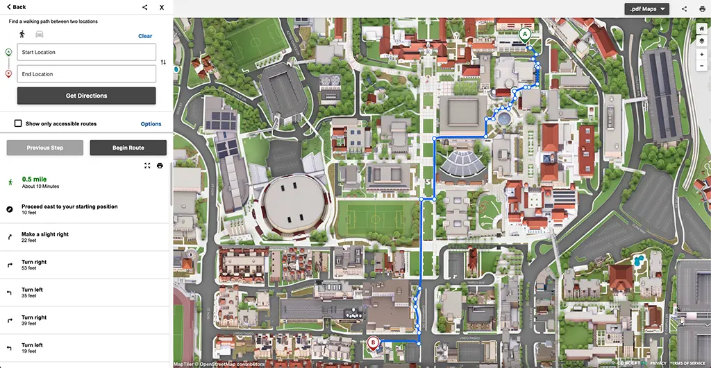
- Outcome, not ornament: Directions turn browsing into doing. When a parent can get from a garage to the recital hall (or a student from residence hall to Chem 101 in week one), you’ve converted anxiety into action.
- Accessibility in motion: ADA-aware routing, correct entrances, curb cuts, ramps, elevators: this is where inclusion meets lived experience.
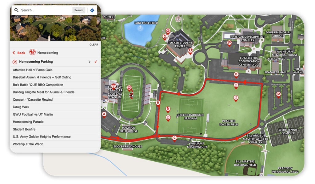
- Contextual efficiency: Directions linked to events, tours, and services (e.g., “route me to the open house at 2 p.m.”) make the map a campus concierge, not a static reference.
The principle is simple: if you ship nothing else beyond search and directions, you’ve already improved student experience.
The false trade-off: 3D vs. performance
Leaders often ask, “Should we prioritize 3D or speed?” It’s the wrong question. The right one is, “How do we stage value so nobody waits for the basics?” Here’s a portfolio model to align stakeholders:
- Floor (always on): Fast load, crisp labels, category filters, search that understands aliases and nicknames, walking directions with accessible routes.
- Beam (proves utility): Real-time or seasonal layers (orientation, construction, commencement), event integration, and correct entrances for routing.
- Ceiling (adds delight): Targeted 3D where it clarifies complexity or tells your story; virtual tour tie-ins; media overlays.
You’re not choosing between speed and spectacle—you’re sequencing outcomes so speed unlocks the chance for spectacle.
A better mental model: “Moment vs. Memory”
- Win the Moment: When a user is on foot, phone in hand, standing in the wrong courtyard, the only thing that matters is a fast, readable route.
- Shape the Memory: When that same user is back home deciding where to enroll—or an alum is reminiscing—3D, photo galleries, and tour content deepen emotional connection.
Design for both states, but never let “Memory mode” slow down “Moment mode.”
What the data typically shows (and why it matters)
Across higher ed digital experiences, three patterns are remarkably consistent:
- Speed drives use. Fast, mobile-first maps earn repeat engagement across the term (schedule changes, exam locations, events).
- Directions drive trust. The share of sessions that trigger walking routes correlates with lower “I’m lost” support volume during peak weeks.
- 3D drives depth. Once the basics are done, dwell time increases when users explore 3D and media—particularly among prospective students and families.
This isn’t about chasing vanity metrics; it’s about aligning time-to-help, task completion, and place affinity with your student experience goals.
How this reframes your three pressing questions
Q1. What’s more important: 3D buildings or mobile performance?
A: Mobile performance is the floor—without it, nothing else gets used. 3D is the ceiling—deploy it to clarify and inspire. Design so 3D never blocks the basics.
Q2. I need a map that can give walking directions between buildings—what matters?
A: Prioritize reliable, on-campus wayfinding: accurate paths, correct entrances, ADA-aware routing, and clear time estimates. Tie directions to events and services so the map becomes a daily utility.
Q3. How do we make campus easier to navigate online for newcomers?
A: Meet them where they are: mobile devices, stressful moments, incomplete context. Deliver fast clarity, proven routes, and just-in-time layers (orientation, construction, parking). Make accessibility a default, not a filter.
Governance beats heroics
Great maps aren’t one-off design victories; they’re operational systems. A few governance truths:
- Shared ownership: Facilities, disability resources, and communications should each own a piece of accuracy (paths, accessibility data, messages).
- Seasonal readiness: Orientation, move-in, and commencement deserve their own temporary map layers—published early, retired quickly.
- Continuous listening: Watch zero-result searches (“JKB,” “Wellness,” “Testing”) and add synonyms. Observe where directions frequently start and end; improve signage and digital labels together.
This is how maps become living infrastructure rather than annual projects.
What “great” looks like (in the wild)
- A parent on Admitted Students Day opens the map from a text. It loads instantly, shows parking and the Welcome Center, and offers a one-tap route. Stress drops; day starts right.
- A first-year student taps “Accessible Route” and gets a ramp-friendly path to biology lab, routed to the correct entrance—not the building centroid. Inclusion shows up as time saved.
- A prospect at home toggles into 3D, explores the arts complex and athletic facilities, and jumps into a virtual tour scene. Their memory of your campus now has shape and scale.
In each case, the experience works because speed unlocked action, and action created space for story.
Decision guardrails for campus leaders
Use these as quick filters in vendor conversations and internal reviews:
- Performance first: Does the map meet mobile speed targets under typical campus Wi-Fi and LTE conditions?
- Wayfinding with integrity: Are routes accurate to entrances and ADA-aware by design?
- Clarity at a glance: Are names, categories, and search synonyms tuned to how your community speaks?
- 3D with purpose: Is 3D optional, progressive, and targeted to high-impact areas?
- Operational fit: Can non-developers update layers for orientation, construction, or events in minutes, not days?
- Accessibility, truly: Is there a high-contrast option, keyboard navigability, and a text-first directions fallback?
If you get five out of six, you’re close. If you get all six, you’ve built an asset that compounds value every semester.
The strategic payoff
When you orchestrate performance, wayfinding, and 3D with intention, you get more than fewer lost visitors:
- Student confidence: Week-one success becomes a retention asset.
- Operational calm: Fewer “where is…?” calls during peak events; staff time returns to higher-value work.
- Brand lift: Prospects experience a campus that feels both welcoming and distinctive—online and on the ground.
That’s the map that welcomes everyone.
Where Concept3D fits
Concept3D’s platform is built around this portfolio approach: mobile-first performance, ADA-aware walking directions, and purposeful 3D where it clarifies and inspires. If you want a quick benchmark of your current map against these guardrails, we’re happy to share a pragmatic assessment and a phased path forward—no heavy lift required.
Ready to align your map to the outcomes that matter? Schedule a Concept3D demo to see how campuses like yours balance speed, wayfinding, and 3D without compromise.